
Design With Me: The Art of the Perfect Palette
A Practical Guide to Choosing and Applying Color
Color is one of the most powerful tools in a designer's arsenal. It sets the tone, defines the mood, and tells a story about the home and the people who live in it. This week, we're breaking down how to choose and apply the perfect palette, from understanding color psychology to mastering the art of the accent color.


Mastering Your Color Story
From paint to textiles, every hue plays a part in your home's color story. Here are the key elements to consider as you build your perfect palette:
1. Understanding Color Psychology: Colors have a profound effect on our mood. Blues and greens often evoke a sense of calm and tranquility, while warmer colors like reds and yellows can feel energetic and inviting. Choose colors that align with the feeling you want to create in each room.
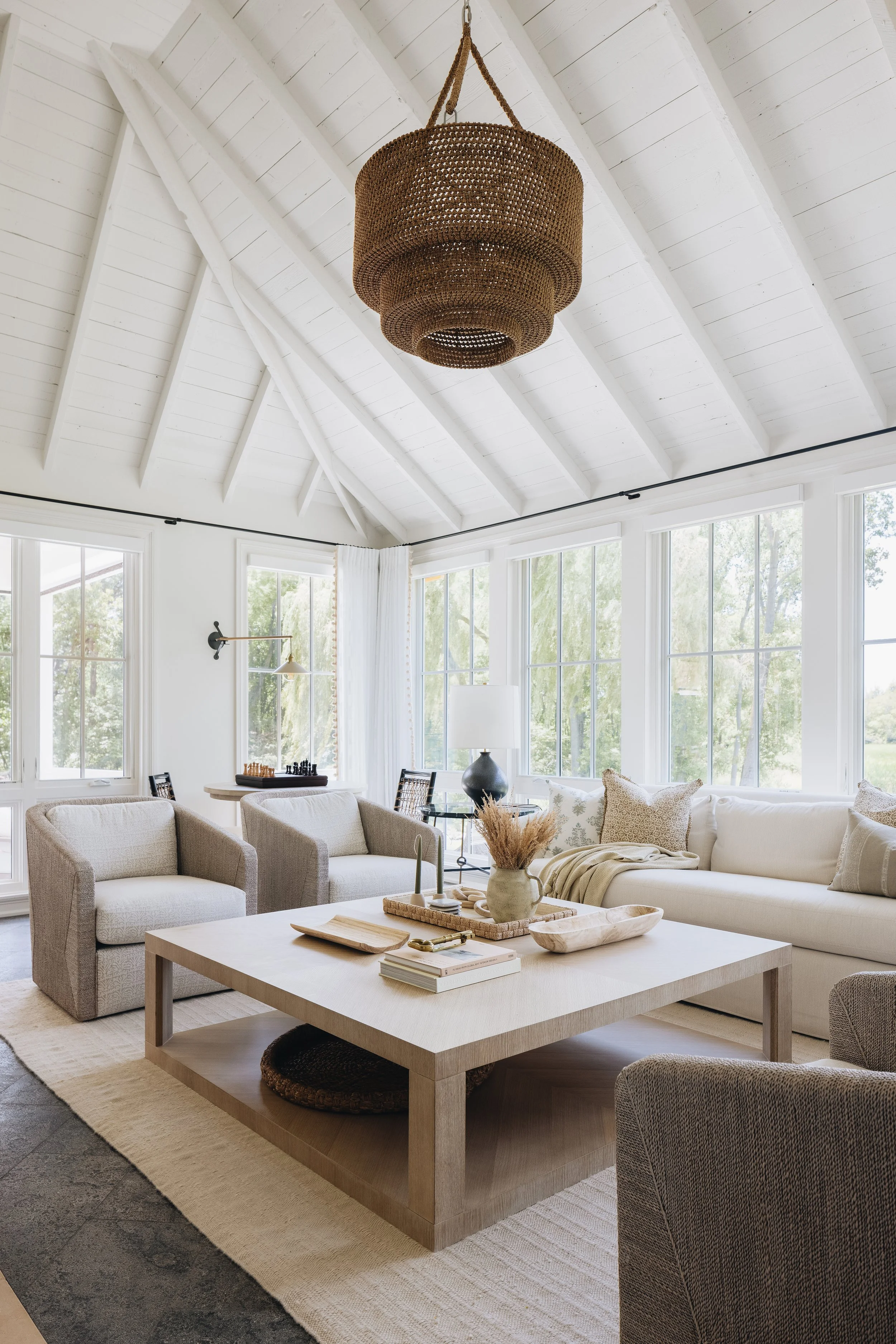
2. The Power of Layered Neutrals: A truly beautiful neutral palette is never boring. It’s all about layering different shades and textures, think warm whites, soft grays, and sandy beiges, to add subtle depth and dimension. This approach creates a sophisticated, timeless base that can be easily updated.
3. Adding Strategic Accent Colors: Once you have a strong neutral foundation, it’s time to add personality. Introduce a vibrant accent color through pillows, art, or a piece of furniture to create a focal point and inject a pop of energy without overwhelming the space.
4. How Light Affects Your Hue: Before you commit to a color, always test it in the space. Natural light, artificial lighting, and even the time of day can drastically change a color's appearance, making it appear warmer, cooler, or more vibrant than you expect.


That's a wrap for this week's Designer Digest!
Stay tuned for more travel stories, design inspiration, and exclusive content next week!
P.S. Don't forget to follow us on social media for even more design and travel tips to fuel your creativity!