
COLOR MY WORLD: PAINT IS NOT JUST FOR WALLS

If you are a decor enthusiast, you can probably rattle off a few lofty names of various paint colors that are “swear by” status across designers, regions, styles, and more! Do the names “Swiss Coffee”, “Downpipe”, “Pigeon”, and “Kendall Charcoal” all sound familiar enough to entice you to read on for more? If so, today’s blog is sure to get your creativity revving as we discuss where and how to bring in interest in your home with paint - and introduce you to some more of our faves!
We shared our go-to “light neutrals” and “moody darks” choices back on this blog post in 2020 - and we still love these! Today’s focus extends beyond just walls, though….we are talking about - trim, paneling, windows, and doors!
TYING IN THE TRIM

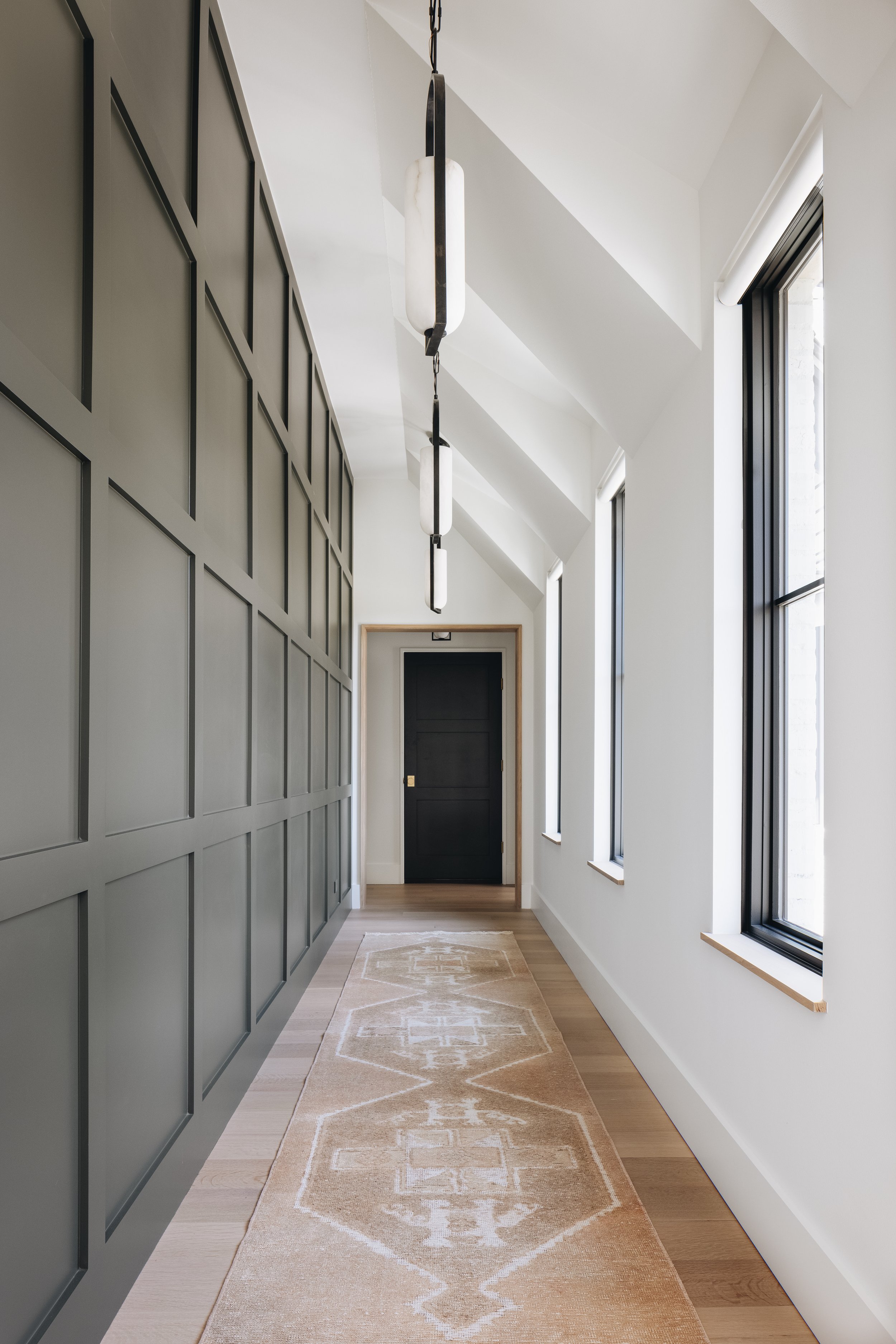
For a more pulled together look with mid- and darker tones, we really love the idea of painting trim (baseboards, crown molding, door and window trim) in the same color as what is on the walls…but in a different finish! A consistent color makes the space feel much more cohesive, especially with lower ceilings, and the subtlety of wall paint in a flat finish and trim paint in a satin finish brings a level of sophistication!
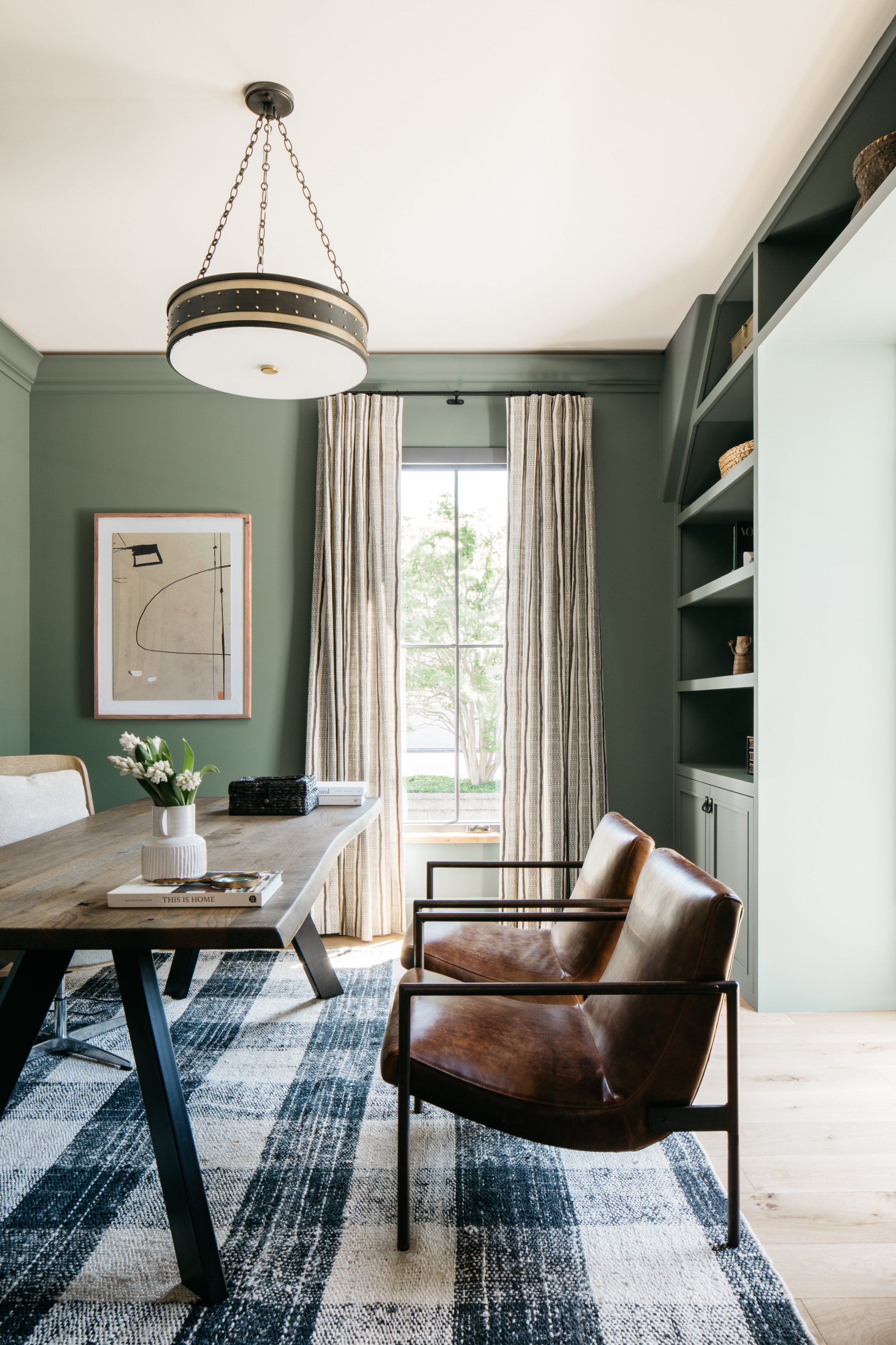
Another look that is a bit more traditional but definitely adds depth is to paint the trim a color, paired with a light neutral wall. This is unexpected and definitely not overdone - so a fun trick to claim as your own!
Photo Credit: Whittney Parkinson
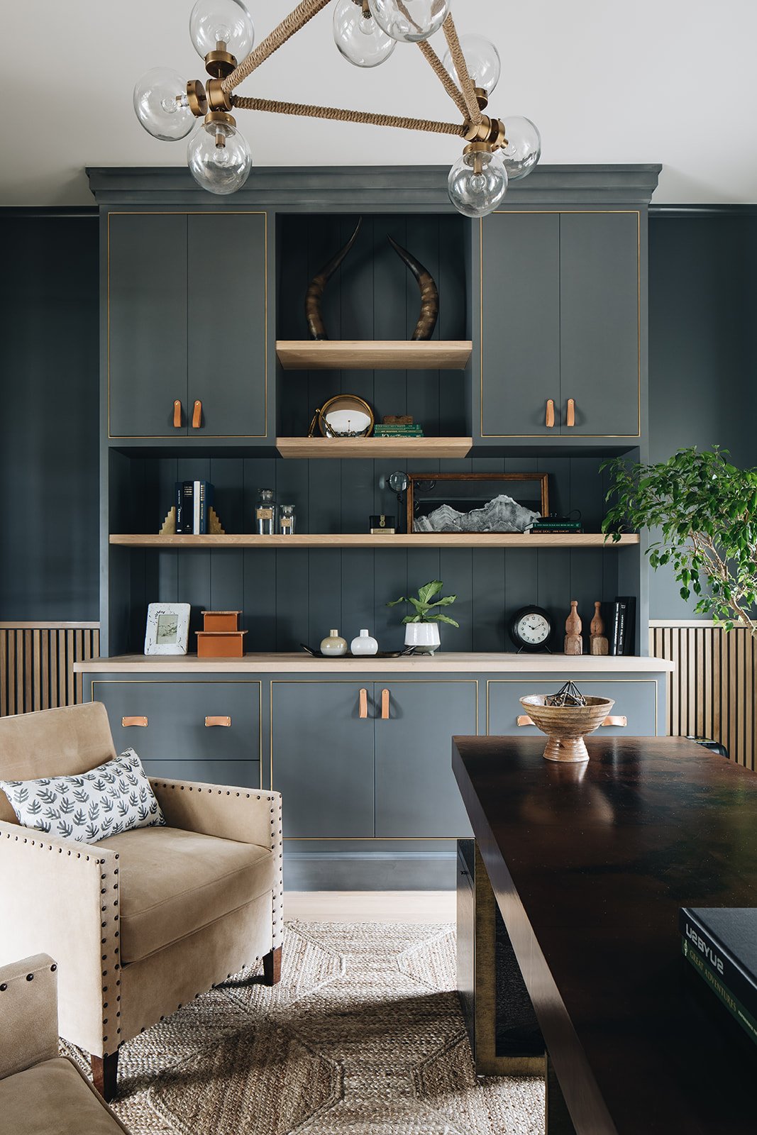
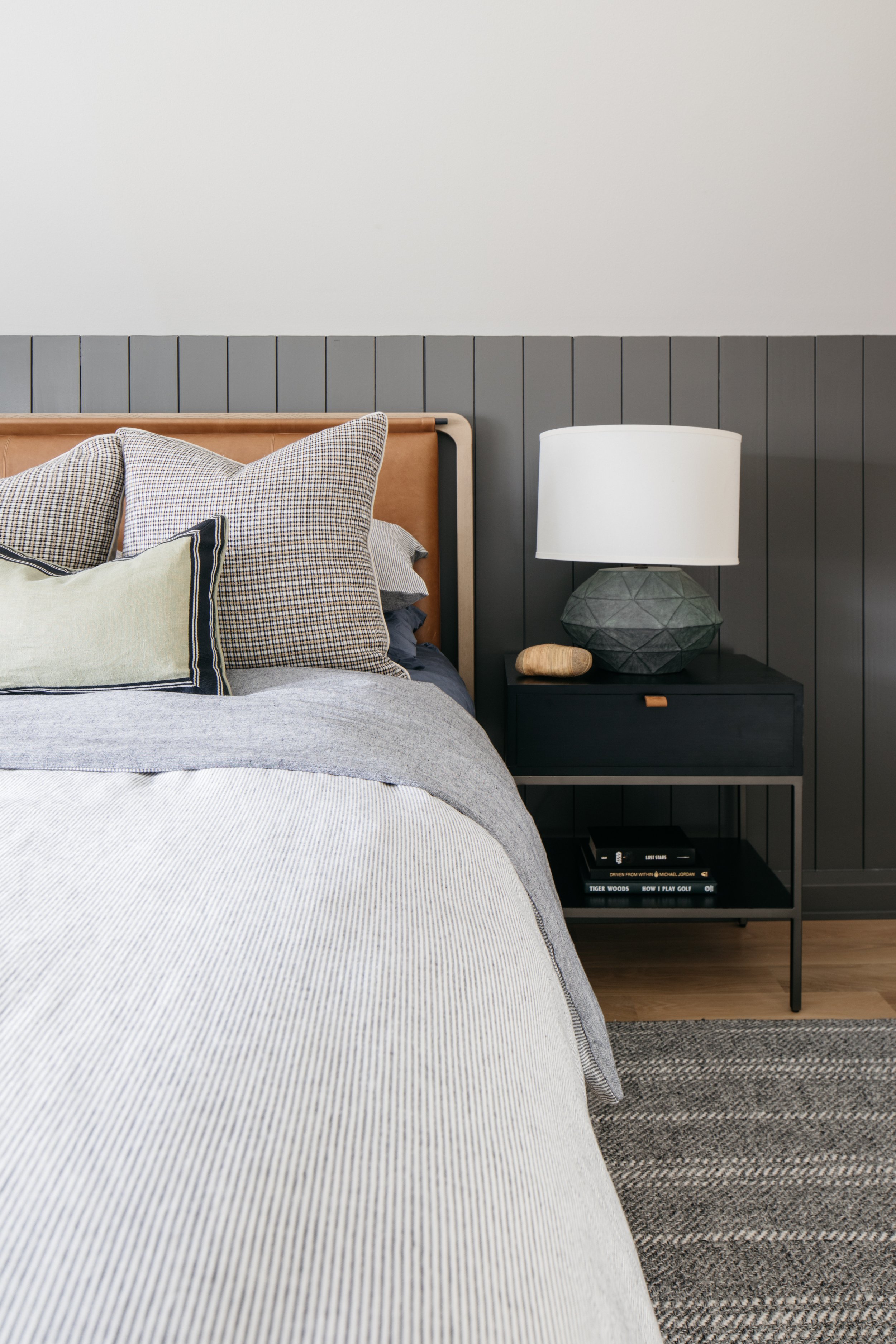
PANELING PAYS OFF

#therightfitclient
Elevate your walls with painted paneling! This brings in texture and color, and can often be done in MDF or wood for different price points. Vertical paneling, traditional shiplap, or a board & batten pattern are all timeless ways of ensuring your room goes from basic to attention-deserving! Paneling, like baseboards and crown molding, we also advise to do in a satin finish.
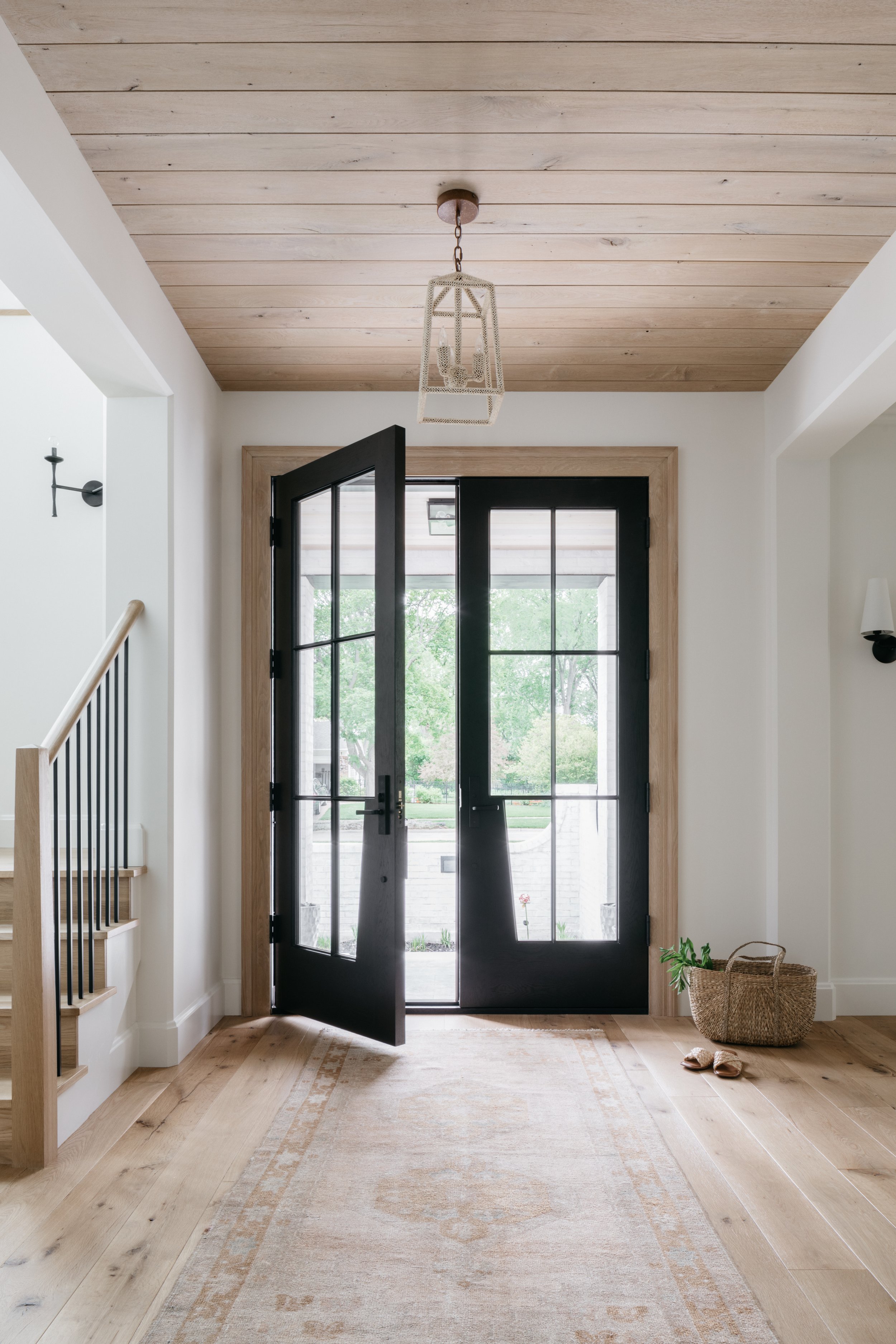
WINDOW WORK

#markermasseria
If you have existing wood windows, or are replacing metal windows with new aluminum, vinyl, or even wood, you have the opportunity to select a color to infuse some interest in an often overlooked area! While white is overwhelmingly the default color for window trim, we love a dove gray or a warm charcoal! Subtle or dramatic, think of it as a frame for your exterior landscapes! Vendors often have standard colors from which to choose but also some window manufacturers offer custom colors for an additional fee.
Here are some looks that go beyond white and yet do not feel like a passing trend!
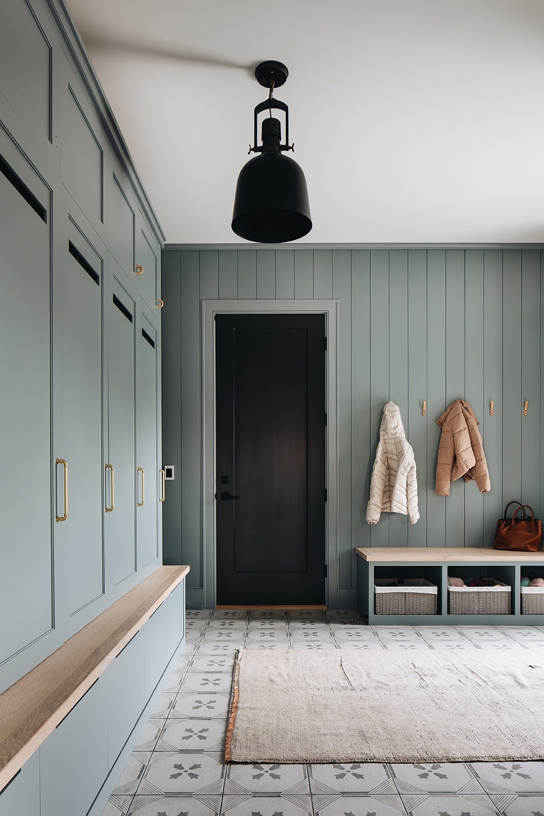
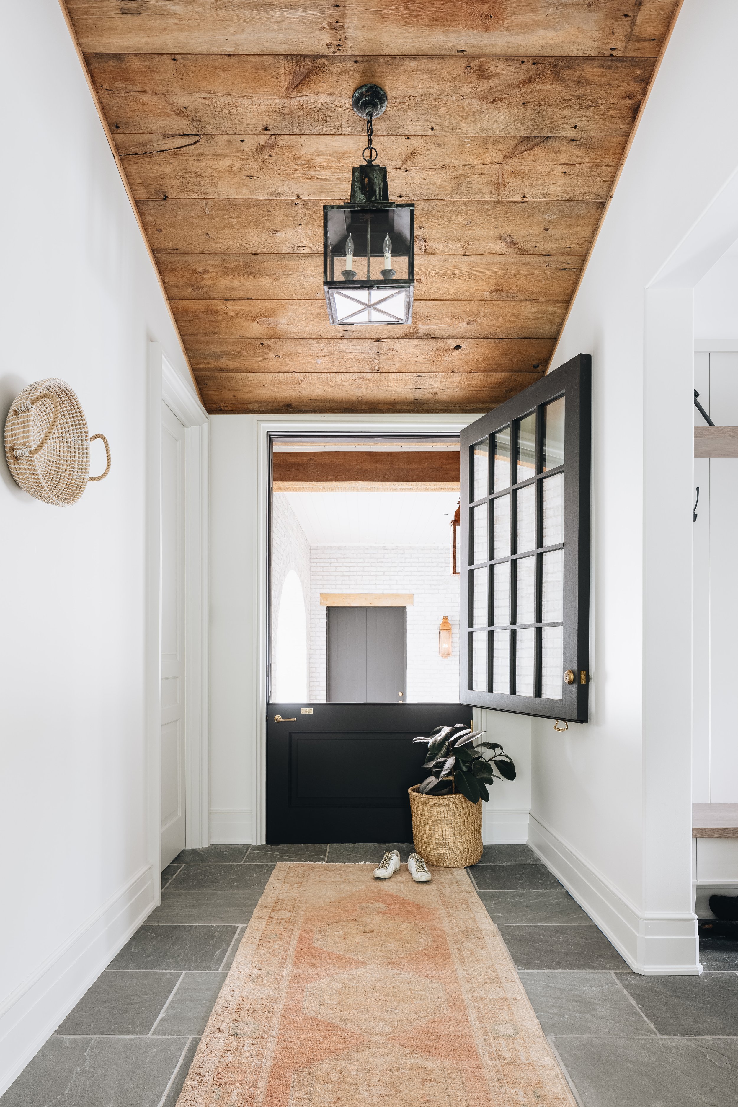
DOORS LEAD TO…..
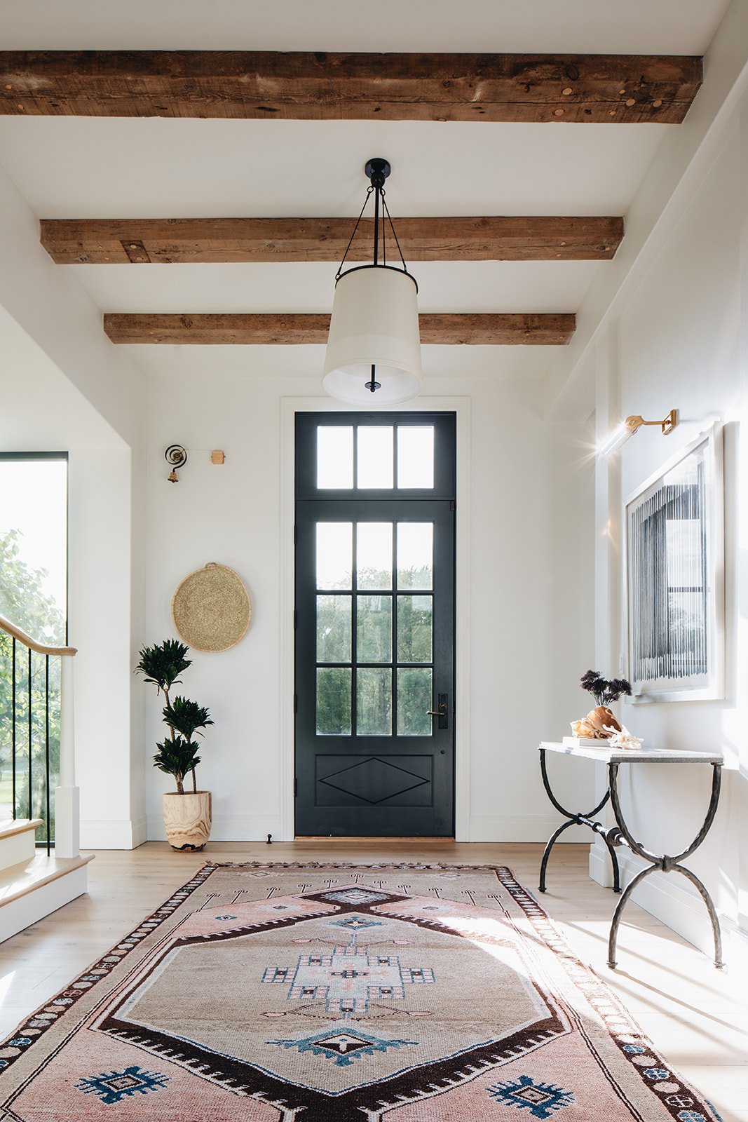
#twoeyesondesignclient
Opportunities! If ceilings are the “fifth wall,” then doors can be considered a specialty surface that can deliver some color! Don’t limit your options to just a front door, however. Ideas to think about include a door at the end of a hallway, a door in a workspace such as a mudroom that brings some fun or whimsy, or even bathroom or closet doors in an ensuite arrangement!
SURPRISE! NOOKS FOR THE WIN!
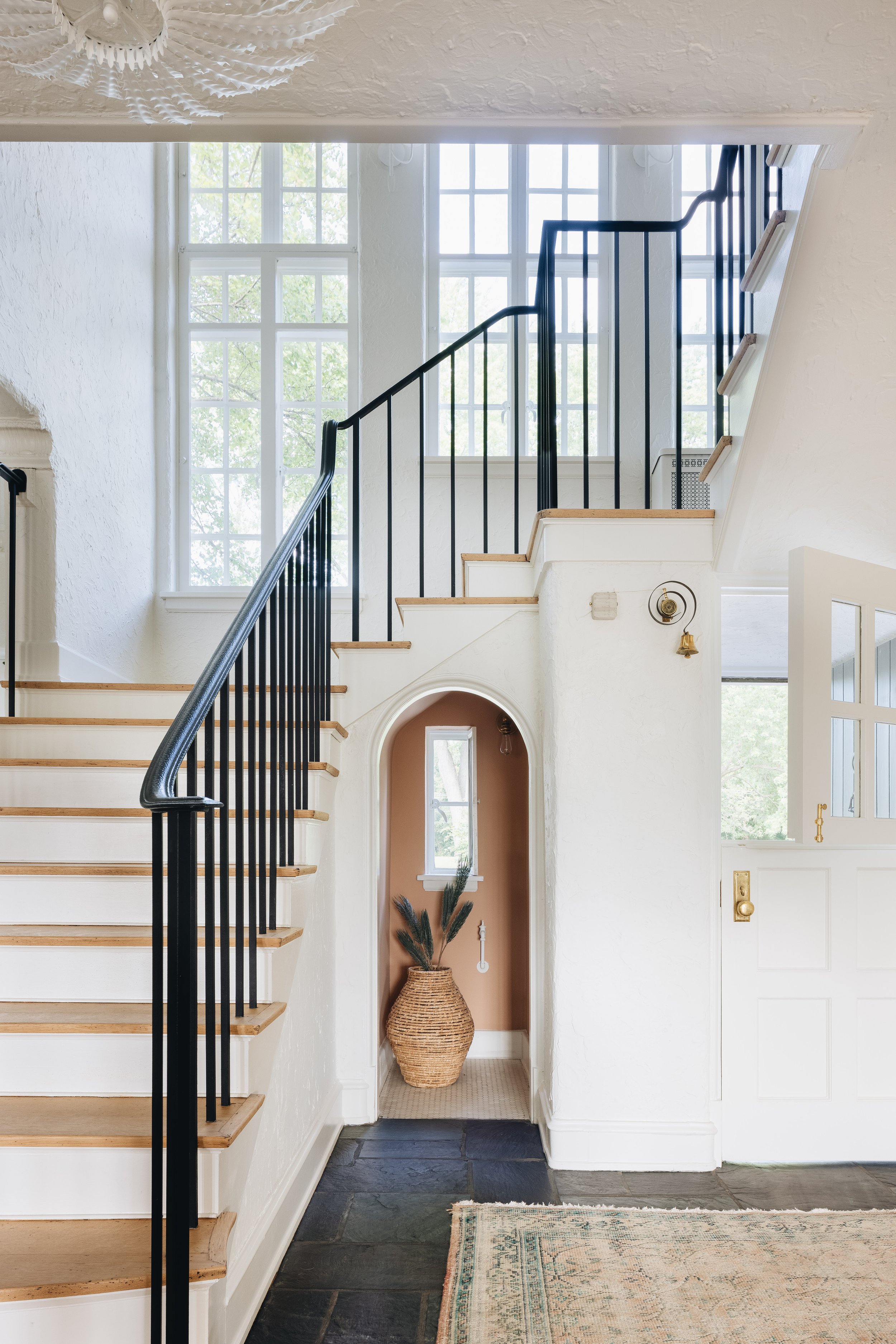
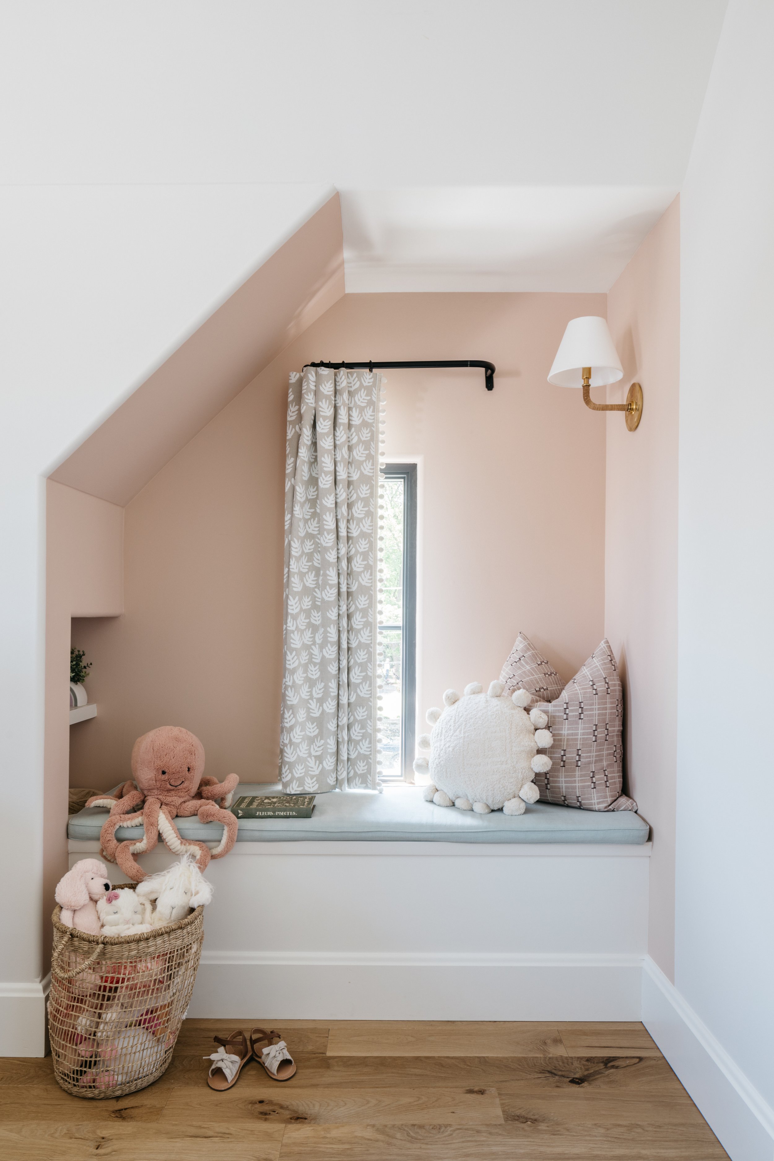
Last but not least, if you are lucky enough to have a home with a little inset nook, window seat, or alcove, allow it to have a large visual impact despite its Lilliputian size! This adds character and let’s the architectural details of each space get the attention it deserves!
SOME OF OUR FAVORITE “FEATURE” COLORS

READ FROM LEFT TO RIGHT AND TOP ROW TO BOTTOM:
Setting Plaster by Farrow & Ball
Brewster Grey by Benjamin Moore
Cape May Cobblestone by Benjamin Moore
Kendall Charcoal by Benjamin Moore
Iron Mountain by Benjamin Moore
Green Smoke by Benjamin Moore
Dark Olive by Benjamin Moore
Mistletoe by Benjamin Moore